MedicVR — Iteration 1: Part 2
Exploring VR Interactions
The design exploration phase brought the initial research findings to life. This page outlines the creation of intuitive VR interactions, from prototyping gestures to creating three-dimensional menu placements.
Interaction Exploration
The first step in the design exploration phase focused on prototyping and refining key interactions within the VR environment. These interactions were central to helping users navigate and manipulate objects in a way that felt natural and intuitive.
Prototyping Key Interactions
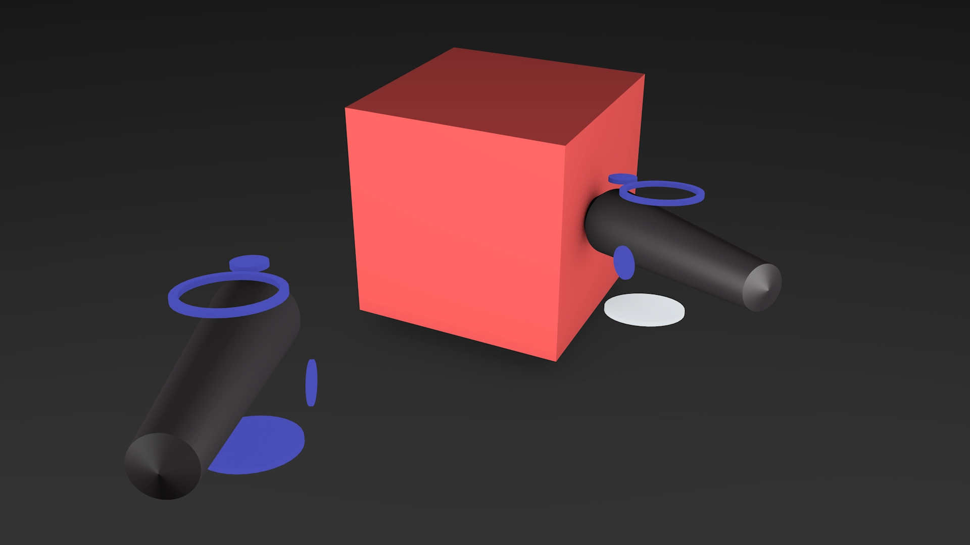
Core interactions such as grabbing, rotating, zooming and highlighting were prototyped using simple cube patterns. These prototypes allowed the team to test and iterate interaction models without the complexity of fully developed assets. The goal was to mimic real-world gestures, allowing users to intuitively interact with the virtual space. For example:

Zooming
Users could bring their hands closer or further apart to scale objects, similar to familiar touchscreen gestures.
Marking/Highlighting
A simple pointing gesture allowed users to annotate or mark objects directly within the VR environment.
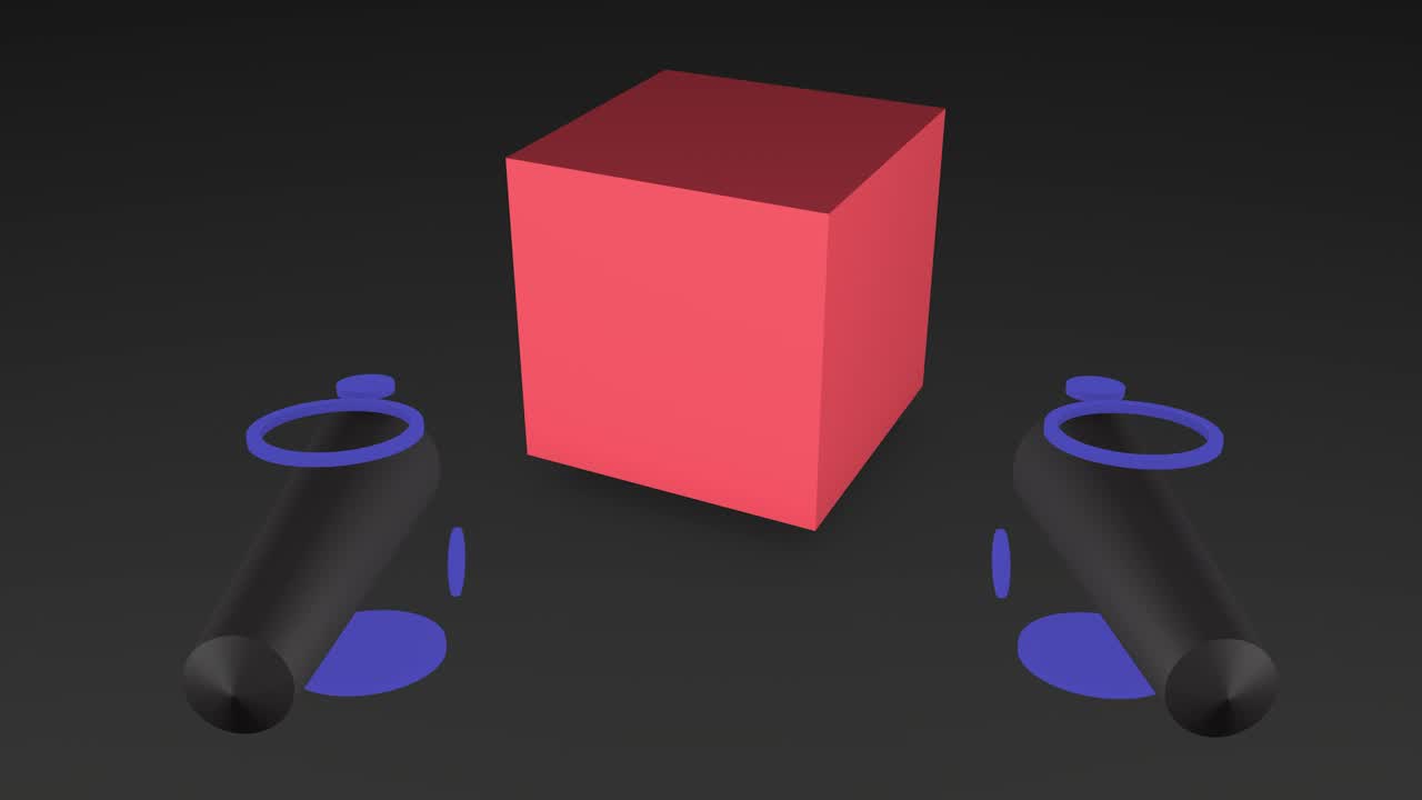
Grabbing
Users could reach out and "grab" cubes with a pinching motion, simulating a natural hand movement.
Rotating
Rotational gestures, like twisting the wrist, were used to manipulate objects in 3D space.
These interactions were tested iteratively with a small group of medical students and professionals. Feedback was collected on the ease of use, intuitiveness, and physical comfort of each gesture. Adjustments were made based on this feedback to refine the interaction models. For instance:
The grabbing motion was adjusted to include a slight haptic feedback, improving the sense of realism.
The zooming gesture was fine-tuned to reduce oversensitivity in the interaction, ensuring precise control over object scaling.
Marking gestures were simplified to reduce arm fatigue during prolonged use.
Geometry and FORM Testing
An essential part of the design exploration phase was experimenting with various forms, shapes, and geometries to determine the most effective menu placement within the VR environment. The goal was to identify configurations that balanced accessibility, comfort, and usability. Three menu placement options were prototyped and tested with users to evaluate their effectiveness:
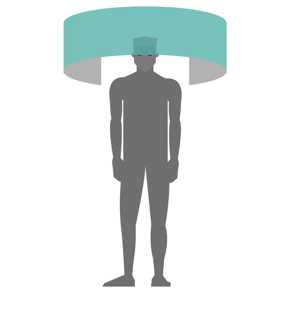
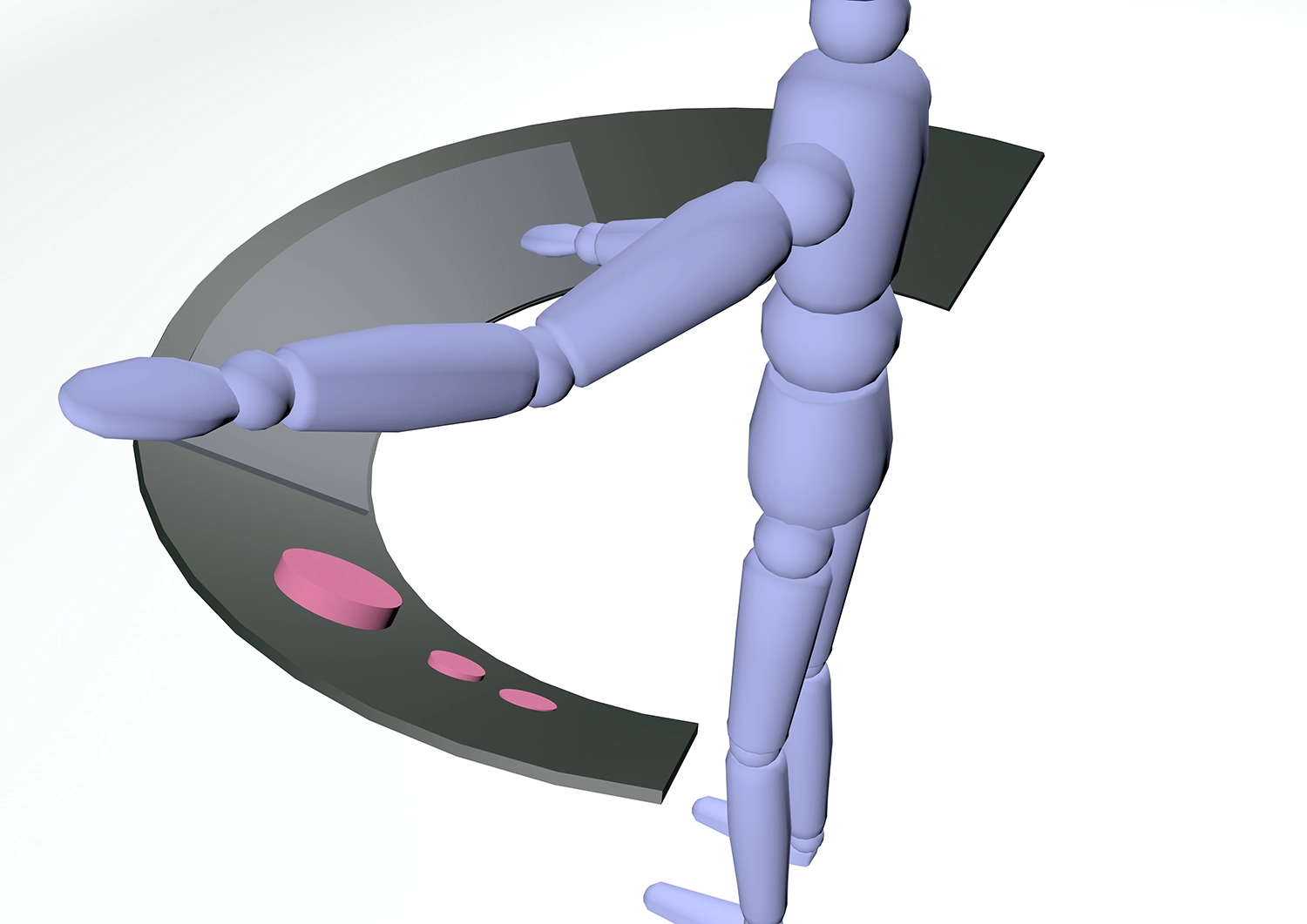
Overhead Ring Menus
Positioned above the user's head, these menus provided a 360-degree view of options, but were found to be physically demanding for prolonged use, so the overhead position can be used for low-priority information.
"Tower" Menus
Located on the floor (or floating at body-height), these menus were visually easy to access and interaction was fairly straightforward for users, although users often had to bend or look down while interacting with them, causing discomfort over time.
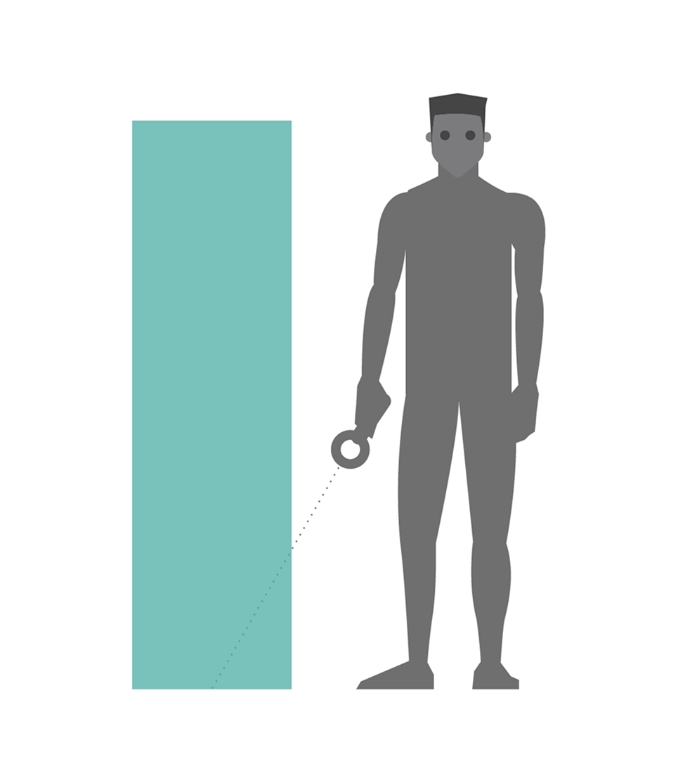
Waist-Level Floating Menus
Positioned at waist height, these menus allowed users to interact comfortably without straining their neck or back, as the slightly tilted head position felt natural.
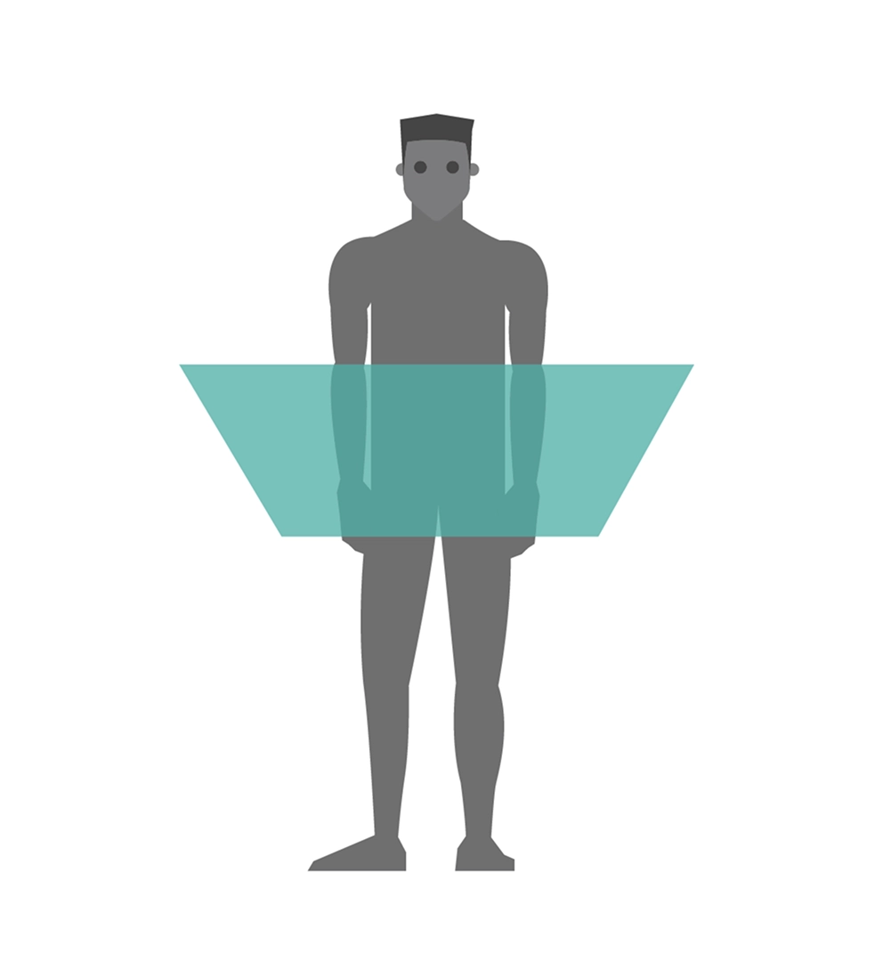
Participants preferred floating menus at waist level because they were easy to access, required minimal physical effort and were within the user's natural field of view. This placement also allowed for better multitasking as users could interact with the menus while maintaining focus on the virtual environment. However, a combination of positions is recommended if the software is intended for long-term use, to encourage the user to change their ergonomics.
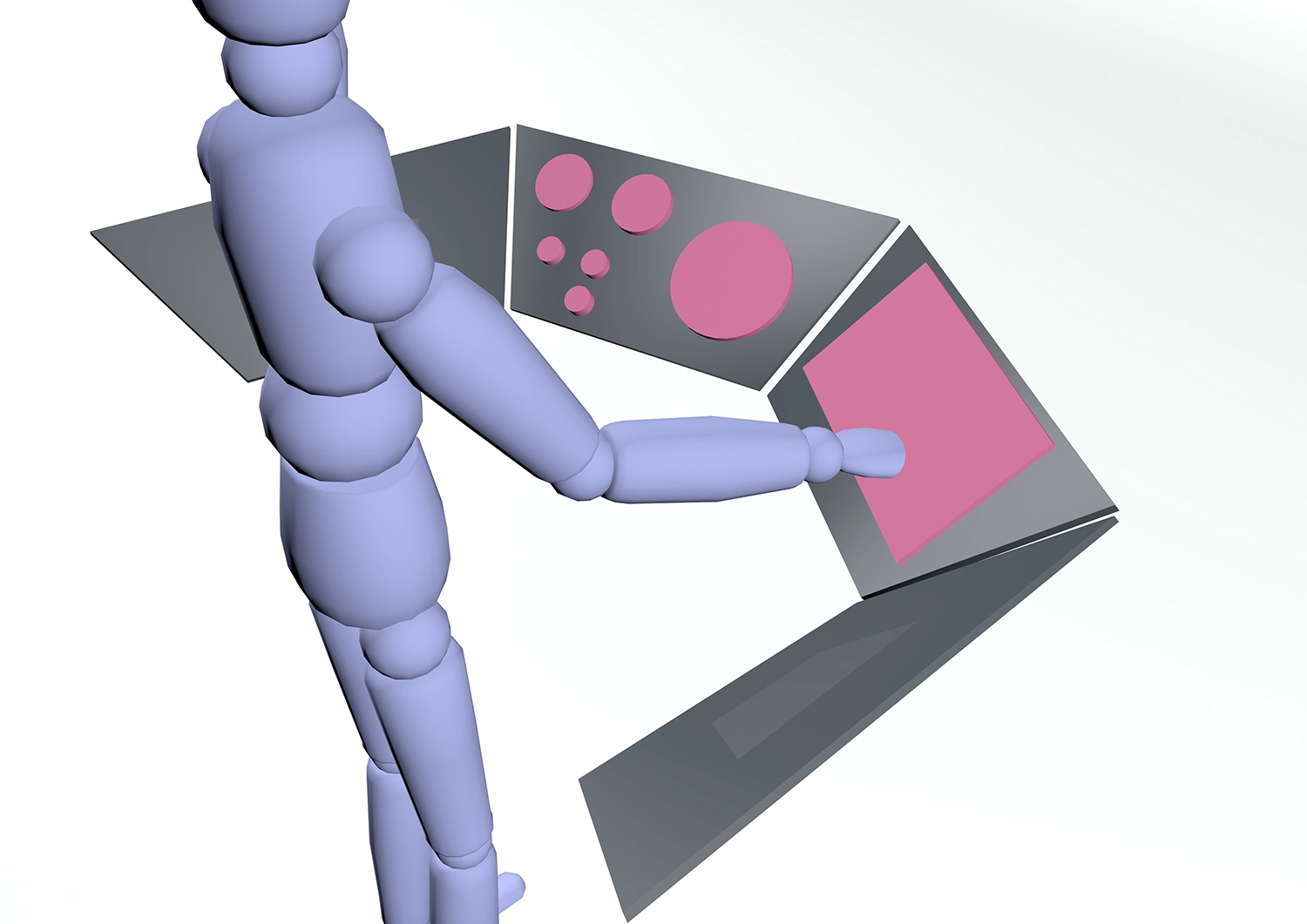
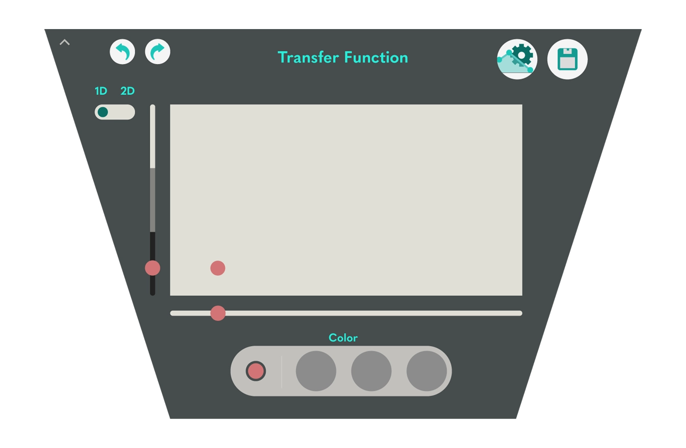
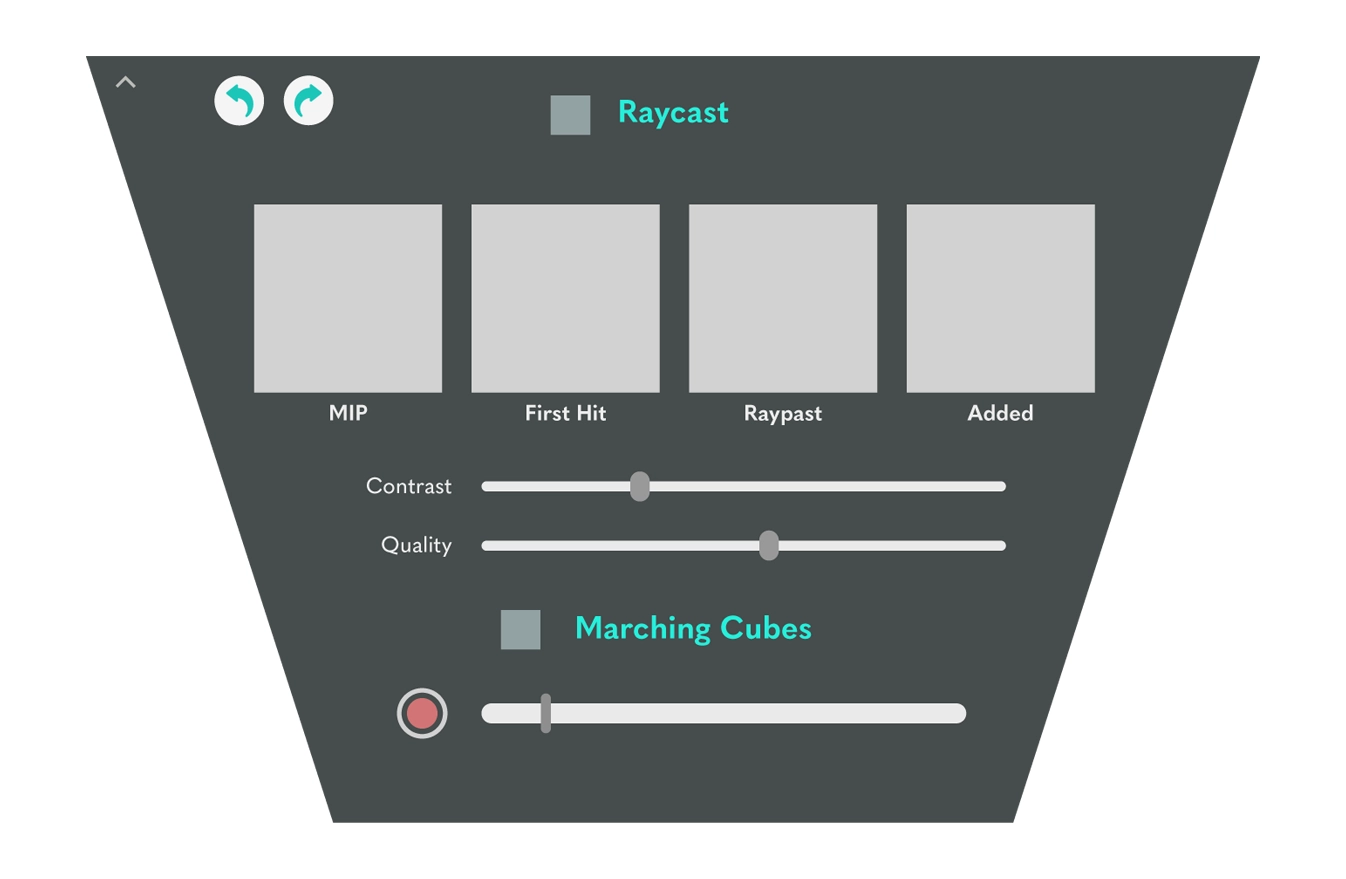
Trapezoidal Menu Modules (first draft)
Flat, trapezoidal shapes were used for menu modules to address the issue of visual distortion in VR environments. Unlike curved designs, these shapes ensured that menus remained clear, accessible, and easy to navigate. The trapezoidal geometry also maximized usable space while maintaining a clean and organized layout.
Mapping the Interactions
This design exploration phase focused on identifying the essential functionality and defining how users would interact with it. By mapping out these interactions, the aim was to create a cohesive system that integrated all the necessary functionality while focusing on user needs.
Interaction Module: Key interactions include grabbing, rotating, zooming and highlighting.
Annotation module: Allows the user to add notes or highlight areas of interest within the three-dimensional environment.
Menu Navigation Module: Provides easy access to tools and settings via waist-level floating menus.
Customization Module: Allows users to personalise interface elements, such as menu layouts and tool placement, to suit their workflow preferences.
Data Saving and Export Module: Ensures that intermediate steps and final results can be saved and exported for further use or collaboration.
This design exploration phase focused on identifying the essential functionality and defining how users would interact with it. By mapping out these interactions, the aim was to create a cohesive system that integrated all the necessary functionality while focusing on user needs.
